Site Redesign
Giving the site a little facelift.
If you’ve been on my site in the last couple months you may have noticed I did another facelift recently. While I was happy with the earlier version as a means of learning how to make a static site and setting up hosting, I wanted to make a site that’s a little more visually appealing.
Setting up Jekyll and learning the basics of liquid code ended up being far easier than I anticipated. Granted I struggled for a bit with wrapping my head around the starting points, but thanks to the guidance and help from my friend Lukas Murdock, I was able to get past the first learning bump faster than I had expected. Now that I’m feeling more confident with setting up the ground work of a static site, it’s easier to stylize everything a bit more with some HTML and CSS and so I decided to jump in.
Now, I will admit that I wasn’t 100% sure what I wanted when I first opened my text editor and started setting up my project. I had rough ideas of where I wanted to go and key features I knew I needed, but the minor details were missing. I had researched a handful of sites similar to what I needed and used them as starting point to figure out what was important to me.
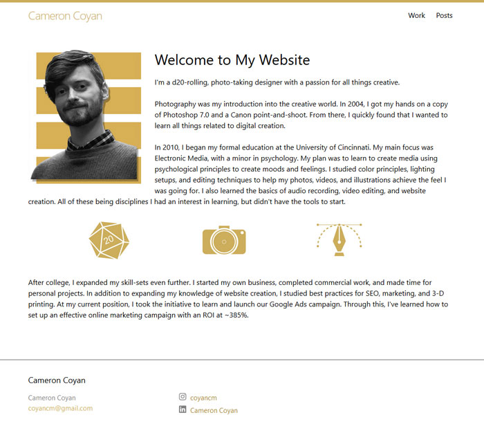
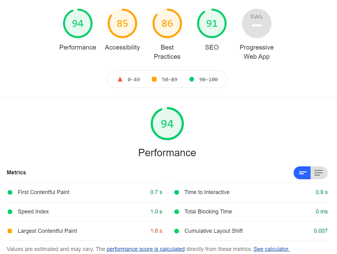
First and foremost; I knew I wanted to keep the layout minimal. My site needs to be fast and compact. Attention spans are getting shorter and the average person doesn’t have time to look through a bunch of content to find the information that’s relevant to them. This also doubles with helping me with my search engine optimization. Google loves sites that load fast and have their content organized (properly structured heading tags, meta data, easy to navigate sitemaps).
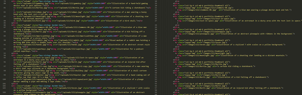
Secondly; I needed a good way to show off photos and other works I’ve done over the years. My old layout was messy for adding images. The plugin I had for the gallery was originally set up with a table that was hard to navigate if I wanted to add something new or rearrange everything. I also wanted to upgrade how my lightboxes worked so users are able to move between images while in the lightboxes.
Finally; I wanted a navigation bar that sticks to the top of the page. This is such a common practice with modern web design that it feels like a sin when it’s not in use. Making your site easier to navigate by making the main buttons in the same place across the site, what’s not to love?
With this I began my journey. I started up a new Jekyll server on my PC and began coding out everything. However, it was towards the end of my index page’s creation that I realized that I was starting to make something very similar to a template I had found while researching site layouts. The template had everything I wanted but in a different way than how I wanted to present my content. So, I changed the scope of my project. Now my goal was to take a free HTML5 template, convert it to a Jekyll/liquid site and customize it to meet my needs.
The first part turned out to be way easier than I would have guessed. my server was pretty much ready to work with the template as soon as I added the files in. Mostly, I just had to mess with my config file and make sure everything was pointed to the correct root. Once that was done the template loaded up on my server without a hitch. Adding the liquid code to make everything a little more friendly on the back end for myself took a little more time. It wasn’t hard by any means, mostly just tedious as there was a lot of back and forth to make sure all my layouts and includes did what they needed to. Honestly, this part was super fun as I got to listen to some podcasts, jam to some tunes and get everything organized.
Once everything was working and organized I began the process of customizing the layouts. There were a handful of pages I didn’t need and most of the ones I did were organized in a way that didn’t match the flow I wanted. I started by pulling what I knew I didn’t need, rearranging what I liked so it aligned more with my goals, checking plug-ins to make sure they functioned properly for what I was doing, and adding my own areas/pages as as needed to bring it all together.
The whole project took a little less than a month (free time can be hard to come by when you work a full time job and help friends with side projects) but I can honestly say I enjoyed all the work and time I spent on it. The site will never truly be “finished” as I hope to have it grow and change with my abilities and work over the years. But, as a whole, I’m much happier with this version of the site over my old layout and having an excuse to refine my skills further is always well welcomed.